


Your website might look visually attractive, but that doesn’t always mean it’s helping your business grow.
Many businesses spend time and money building a website, only to realise later that visitors are leaving without taking action. No inquiries, no calls, no purchases—just traffic that disappears.
In most cases, the problem is not the product or service. It’s the website experience itself.
A modern, good-looking website design is not enough; successful website development requires more than attractive visuals. It should build trust, guide visitors and make conversions. Even a small mistake on a website can reduce conversions.
At Soharon Infotech, we have worked with various industries, and we generally see the same website problem repeated again and again.
Below, we have addressed 10 common website design mistakes that may be affecting your conversions more than you realise.
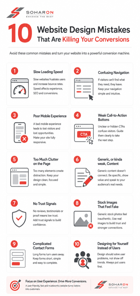
1. Slow Loading Speed
People have very little patience online.
If your website takes too long to load, many visitors leave before even seeing your content. This happens especially on mobile devices, where users expect websites to open quickly.
Heavy images, unnecessary animations, and poorly optimised code are common reasons for slow websites.
Even a delay of a few seconds can affect:
- User experience
- Search rankings
- Lead generation
- Sales
A fast website creates a smoother experience and keeps visitors engaged longer.
2. Confusing Navigation
Visitors should never feel lost on a website.
If people struggle to find:
- Services
- Pricing
- Contact information
- Product details
they usually leave instead of searching further.
Some websites try to be overly creative with menus and layouts, but simplicity often works better.
Good navigation should feel natural. Users should immediately understand where to click and how to move through the website.
At Soharon Infotech, we usually recommend keeping menus clean and organized rather than overloaded with too many options.
3. Poor Mobile Experience
Most website traffic today comes from mobile devices.
Yet many websites still look great on desktops and terrible on phones.
Common problems include:
- Text that’s too small
- Buttons that are difficult to tap
- Broken layouts
- Slow mobile loading
- Images not fitting properly
A poor mobile experience can damage conversions badly because users leave quickly when a site feels frustrating to use.
Responsive design is no longer optional—it’s expected.
4. Weak Call-to-Action Buttons
Many websites forget to guide visitors clearly.
After reading your content, users should know exactly what to do next.
Should they:
- Call your business?
- Request a quote?
- Book a consultation?
- Fill out a form?
If the call-to-action is unclear, visitors often leave without taking any action at all.
Buttons like:
- “Get Started”
- “Book a Free Consultation”
- “Contact Our Team”
should be visible and easy to understand.
A surprising number of websites lose conversions simply because the next step isn’t obvious enough.
5. Too Much Clutter on the Page
Some websites try to include everything on one page:
- Too many colors
- Multiple popups
- Large text blocks
- Endless animations
- Too many banners
Instead of helping users, this creates confusion.
Clean layouts usually perform much better because they allow visitors to focus on important information.
Whitespace is important in web design. A website doesn’t need to fill every empty area.
Simple and organised pages often feel more professional and trustworthy.
6. Generic, or kinda weak, content
Basically, design matters, but content matters as well.
Some websites use these common lines like
- “We provide quality services”
- “Customer satisfaction is our priority”
- “We are the best in the industry”
And the issue is, basically, everyone writes the same thing, people remember something different
Visitors don’t want common marketing; they want something unique.
Instead of those broad statements, a website should explain more effectively, like
- What actually makes the business different
- How the services solve real headaches
- Why a customer should trust the company, and not just believe it blindly
The wording should feel natural and genuinely supportive, not robotic or too promotional.
7. No Trust Signals
- People tend to be a little careful before contacting a business online.
- If your website looks like it has no real credibility, visitors hesitate to move forward.
- Trust signals matter because they help users feel more confident.
- Some common examples: customer reviews, testimonials, real project photos, client logos, certifications, and case studies.
- When those elements are missing, the website can feel sort of unfinished or unreliable.
- Even a small trust-focused section can increase conversions.
8. Stock Images That Feel Fake
Visitors can usually spot generic stock photos pretty fast, like in a second.
Those overused pictures with people shaking hands, a “perfect” office setup that feels staged, rarely make a real connection.
Whenever possible, a business should lean into:
- Real office shots
- Real team imagery
- Genuine project scenes
- Original product visuals
Real visuals that make a company seem more trustworthy and also more relatable.
At Soharon Infotech, we’ve noticed that websites that use real business images tend to drive stronger engagement than sites packed entirely with stock photography.
9. Complicated Contact Forms
Long forms can discourage users quickly.
If visitors need to fill:
- Too many fields
- Unnecessary details
- Long questionnaires
many simply leave halfway through.
A contact form should feel quick and simple.
Usually, basic details like:
- Name
- Phone number
- Message
are enough for initial inquiries.
The easier the process feels, the higher the chance users will complete it.
10. Designing for Yourself Instead of Users
This is one of the biggest mistakes businesses make.
Sometimes websites are designed entirely around personal preferences instead of customer behavior.
Business owners may choose:
- Fancy effects
- Complex layouts
- Difficult navigation
- Trendy design choices
because they personally like them.
But website design should focus on users first.
The real question is:
- “Does this help visitors understand and trust the business more easily?”
- Good websites are designed around user experience, not just visual appearance.
- Why Website Design Impacts Conversions So Much
- People form opinions about websites very quickly.
Within seconds, visitors often decide:
- Whether the business feels trustworthy
- Whether the website feels professional
- Whether they want to continue browsing
A poorly designed website creates friction. A well-designed website makes everything feel easier.
That difference directly affects:
- Leads
- Sales
- Customer inquiries
- Brand credibility
Sometimes improving conversions is not about increasing traffic—it’s about improving the experience for the traffic you already have.
Final Thoughts
A website should do more than just exist online; it really needs to work with your business goals.
Small design mistakes might not feel that serious on their own, yet all together they can quietly lower conversions and nudge away people who could have become customers.
But these problems are fixable, When you improve things like:
- Speed
- Mobile experience
- Navigation
- Content
- Trust signals
- User flow
You can make a major difference, over time.
At Soharon Infotech, we think effective web design is not about adding extra, needless complexity. It’s more about building sites that feel simple, reliable, and comfortable for people to use.
Read more: Web Design Trends for 2025





 SHARE YOUR REQUIREMENTS WITH US!


